allstate
Redesign the Payment History page to show more options and details
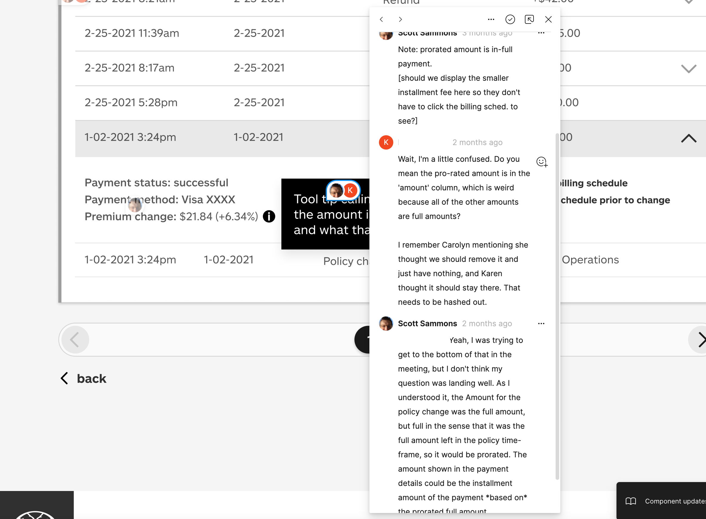
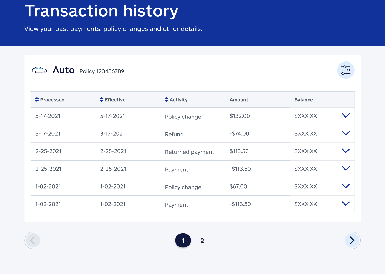
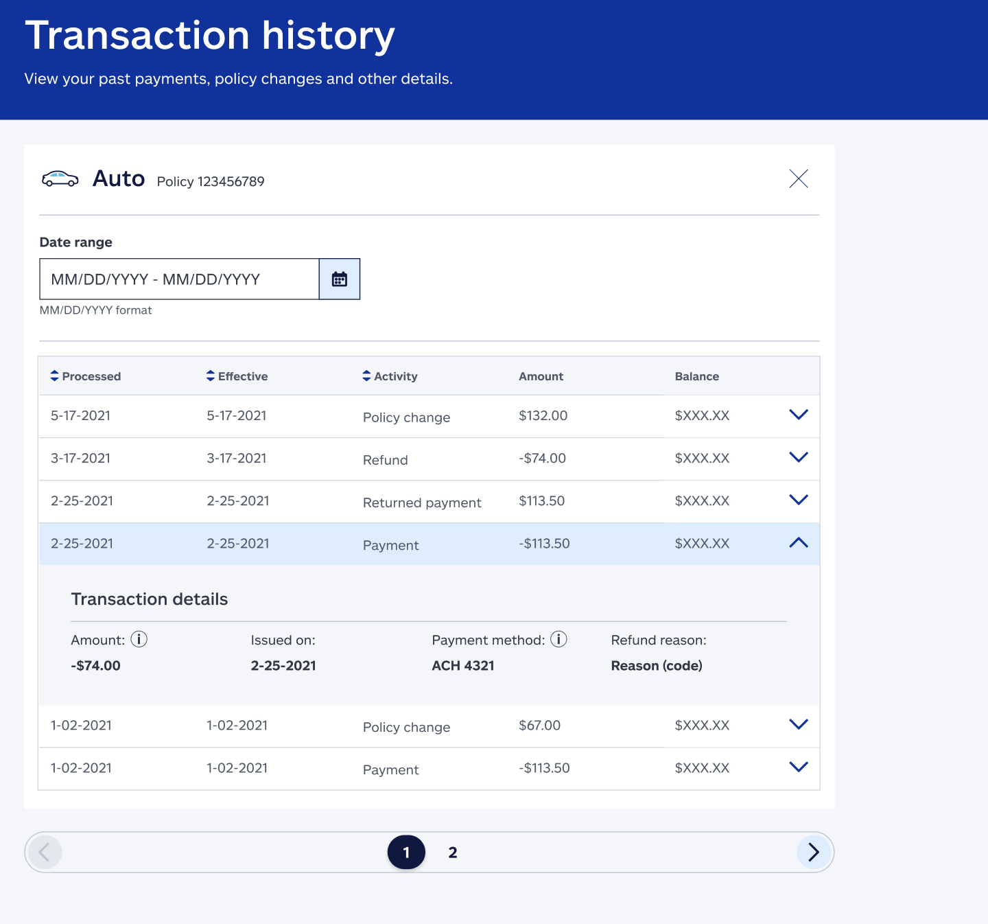
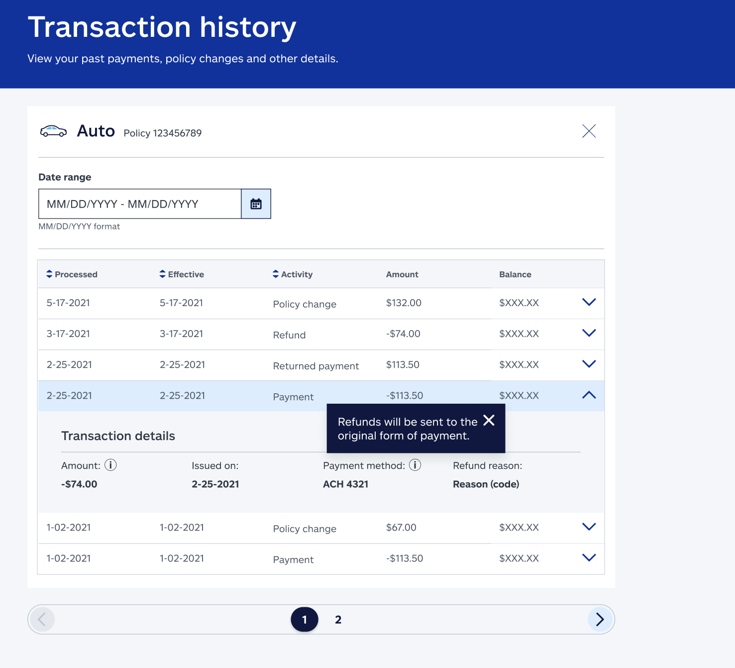
Tasked with improving the Payment History screen, we expanded its scope to display more meaningful transaction details for both customers and CSRs. This included payment status, method, and policy premium changes. To help users navigate complex dollar amounts, I implemented tooltips and added transaction-type filtering, which revealed the need to reframe the feature as “Transaction History.” While back-end limitations prevented us from integrating policy history with payment data, I recommended removing an outdated billing schedule page that created confusion.
ROLE: Content Designer
TEAM: UX Design, Visual Design, Engineering
TOOLS: Figma, Mural
Shado Design
Design a website for a ux design studio
I directing a content-first approach to build a new website showcasing Shado Design’s UX design work. I wrote all the content, including project descriptions, and a contact page for users to get in touch with Shado Design.
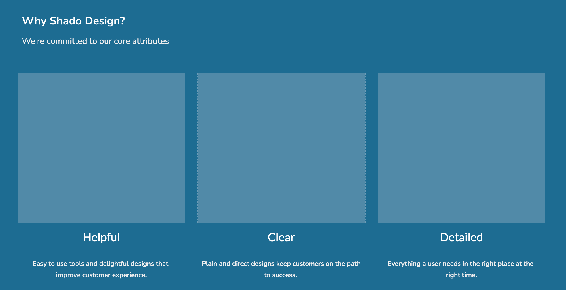
Established target audience, voice, and tone for Shado Design.
Developed clear, easy-to-navigate information architecture.
Built a Wireframe for the Shado Design Website, wrote a Style Guide and performed user testing.
Testers shared an 83% satisfaction rate and intent to contact Shado Design based on all pages reviewed.
ROLE: Content Designer and Strategist
TEAM: UX Designer and Studio Principal
TOOLS: Google Suite
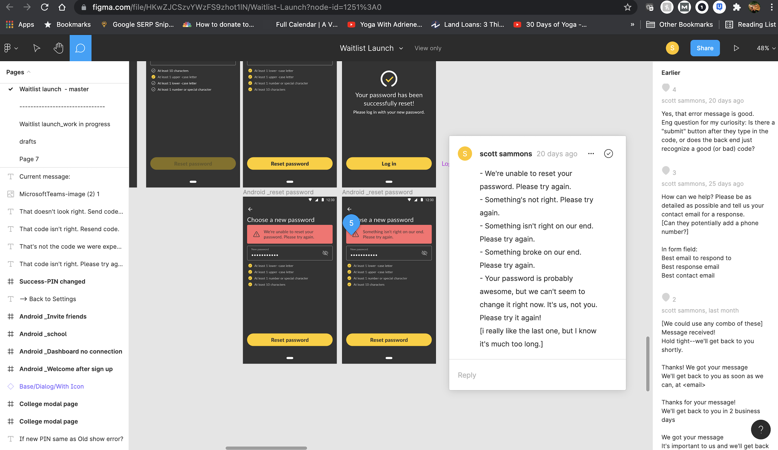
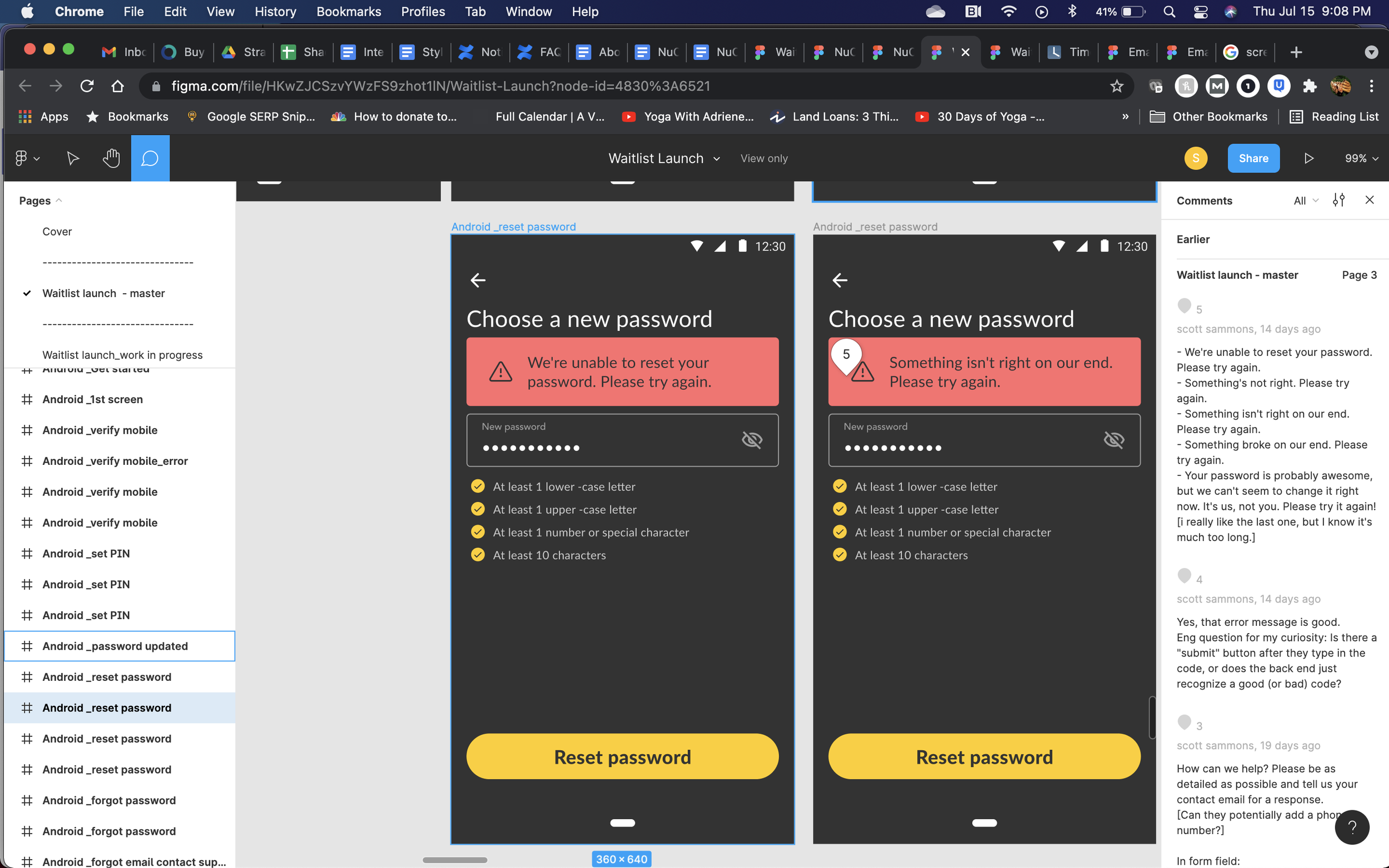
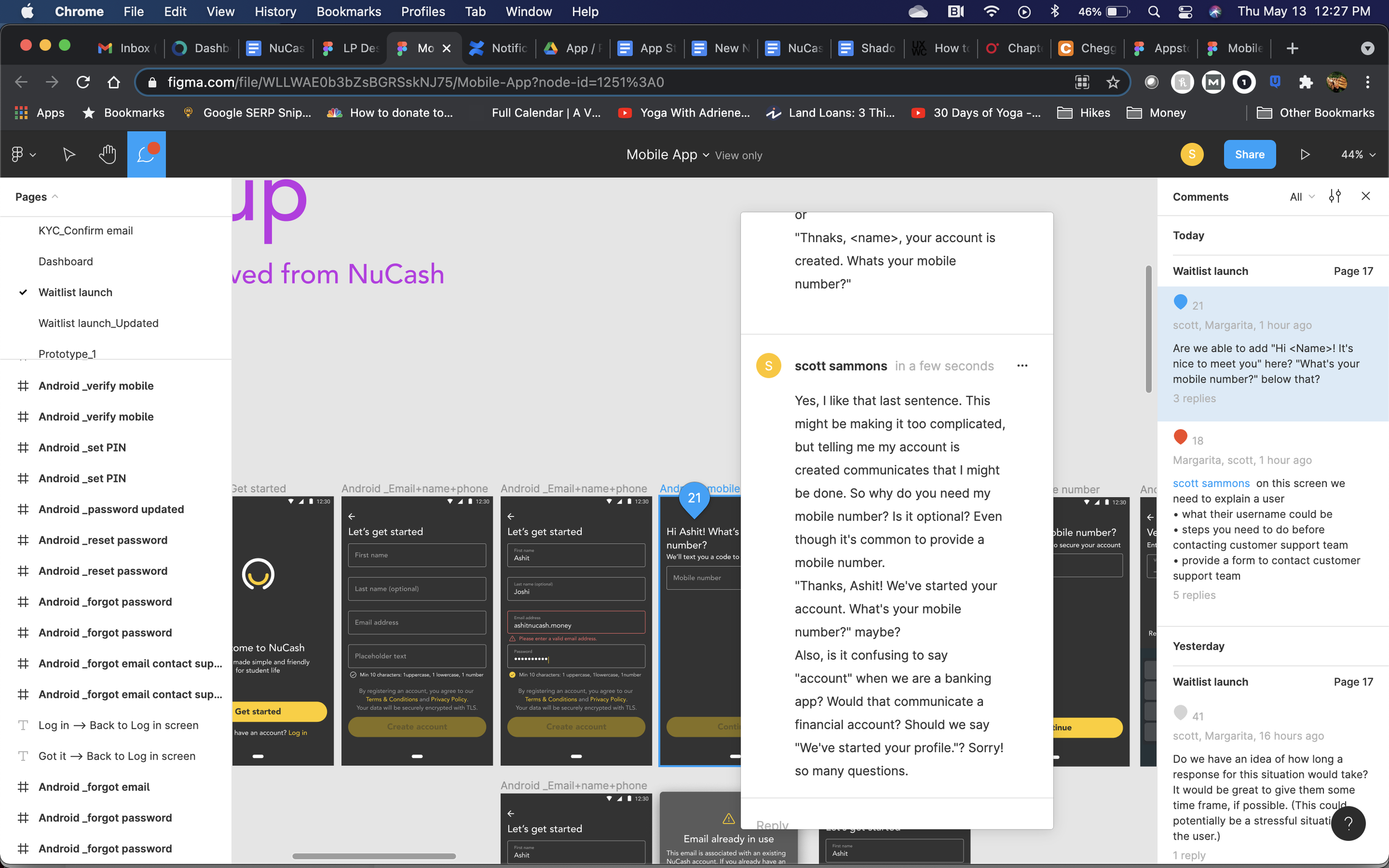
NUCASH
Banking app for college students in India
I helped develop awareness and sign up flow for new users. I created an empathy map to aid in drafting awareness messaging. I reviewed existing testing and feedback to understand audience needs and pain points.
I developed messaging for:
an email onboarding nurture series
a sign up flow including a one-time-password (OTP) security process.
Each step needed to concisely capture the benefits related to the audience and their concerns while ensuring security. I leveraged access to college interns for feedback on terminology and tone.
ROLE: Content Designer
TEAM: UX Designer
TOOLS: Confluence, Figma
PUGET SOUND ENERGY
Move the rebate application process from paper to online

Final pop-up for customers to submit their rebate request
Puget Sound Energy is a gas and electric utility in Western Washington. I helped the Energy Efficiency team move the rebate application process from paper to online. With the team, I reviewed the off-the-shelf solution for usability and clarity.
The product was rudimentary and needed basic functionality and page re-designs to adjust for clarity.
Many design and content recommendations could not be implemented because it was an all-inclusive platform used by many utilities.
Despite this, one year into launch, 85% of all rebates filed used the online tool.
ROLE: Content Designer
TEAM: EE Product Managers, Front-end developers
TOOLS: MS Office, PDF